
Washington’s Standard Part 4: Assembly Required

Museum of the American Revolution, Conserved with Funds Provided by the Pennsylvania Society of Sons of the Revolution and its Color Guard
You’ll notice the flag is not exactly symmetrical. On the original, the stars are arranged in two ghostly shapes that may or may not mimic the Cross of St. George and St. Andrew on the British Union Jack. Once you see it, sure, it’s there, but it doesn’t leap out at me immediately. What would the logic be? I suspect it’s a reasonable way to distribute thirteen stars attractively while not overemphasizing the uneven number. A grad school friend spent a summer working in a pizzeria in New Haven, and learned the trick of balancing pepperoni slightly asymmetrically to make less look like more; a similar principle may have applied here. There’s no real ideological reason to mimic the crosses: this is pure aesthetics.

1998 Silk, Linen Museum of the American Revolution 2003.00.0490
John Glenn’s replica captures the star placement pretty well, and the ways that the stars themselves rotate off-axis as they proceed across the ground. But I needed to be exact, so I did what I always do: I put it into Illustrator.
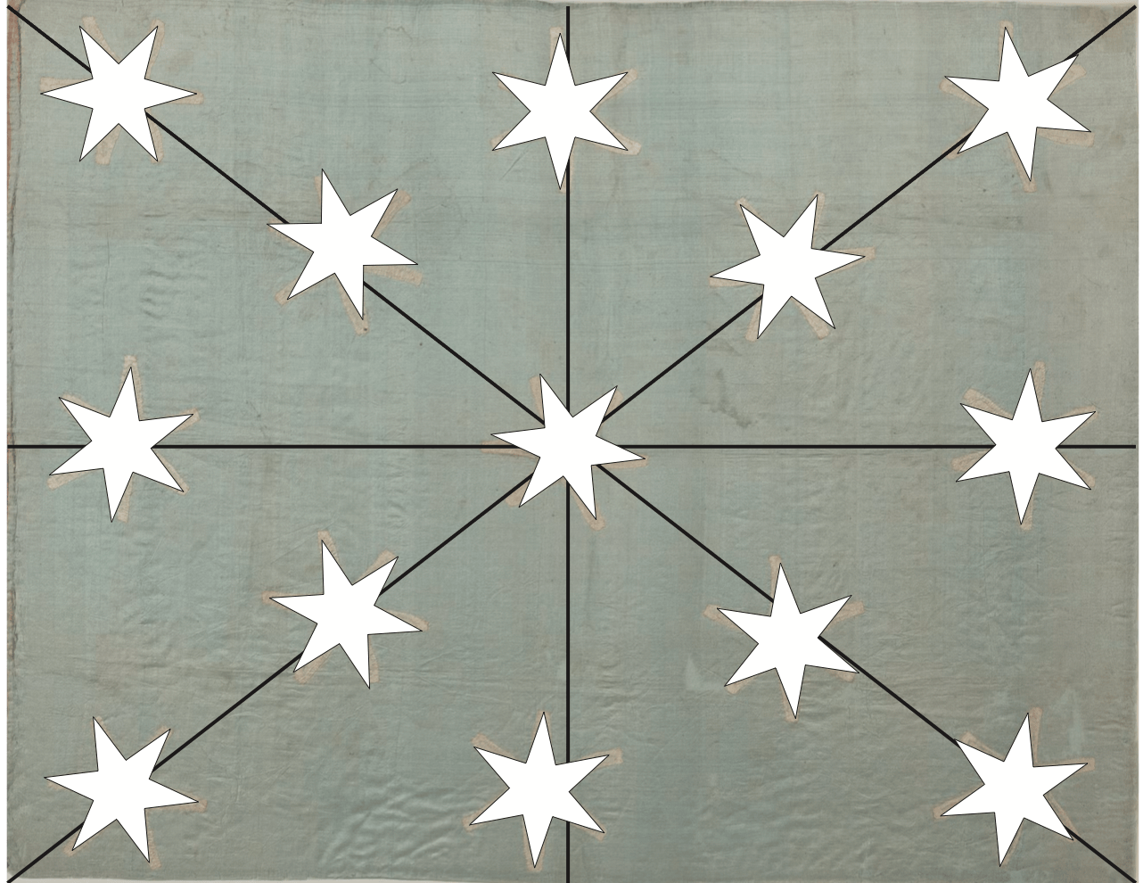
This helped me check (and re-check) the half-scale math and develop yet another way of understanding the flag. Illustrator’s straight rulers and grid clarify the off-axis and rotating stars, so it becomes apparent where choices will need to be made. Is that star off the pattern grid, or is the arm just stretched?
That raised another question: once I have the stars placed in the correct spots, do the star shape distortions need to match exactly, or can the distortions be whatever I create as I sew? We settled on having me match the placement and tilt of the stars, while allowing the individual stars to stretch however they did under my hand. At half-scale, matching distortions exactly would be a challenge best not met under a tight deadline.

I toyed around with the star shape, but never figured out an efficient folding-and-cutting technique for making six-pointed stars. Instead, I cut a pasteboard pattern and traced it. I was two days into my summer vacation, and four days from a hospital stay, so pain may have been a distracting factor.

Stars settled, pattern and distortion settled, I set about transferring the pattern. Instead of tracing the placement in chalk, which would wear off, I basted a generous 3×4 inch grid and the corner-to-corner diagonals to help me place the stars.

Before I cut all the stars, I dabbed fray check or gum arabic around the tracing lines to stabilize the cut edges. Fray check was slightly more effective, but gum arabic was more period-correct. Both helped hold the cut edge in place while I manipulated the seam allowances around the point peaks and in the valleys between the legs. This reduced fraying and, to a small degree, the weird leg distortions seen in the original. I doubt the seamstresses of the 1770s applied stabilizer; they had less time and more skill.
Stars cut, pattern laid out, I was ready to start sewing.


You must be logged in to post a comment.