
Washington’s Standard Part 3: Selecting Materials

A key step in making was to select a ground. There were remnants of the hand-woven, indigo-dyed plain weave silk used by the conservator; from these, a large enough piece with consistent dye saturation needed to be selected. Of the four large enough sections, varying in darkness, we selected the deepest, richest blue. Next, I needed to find a white plain-weave silk for the stars. I ordered samples from several online suppliers, trying to balance color, weave, hand, and luster to find a fabric that worked with the blue. I decided the real test would be stitching test stars, cutting stars from several options to see how the fabric really performed.

Some fabrics that looked like good matches were thick and difficult to turn under crisply. Some that looked right were too thin and lost brightness against the blue. I ordered more samples, I stitched more stars, and in the middle of testing, I spent a weekend at the Museum interpreting upholstery workers who supplied the Continental Army. This gave me a chance to look at the flag in person. Although it’s hard to see the original fabrics through the silk crepeline, I wanted to check the relative albedo of the two fabrics. Were they similarly shiny, or were they of contrasting glossiness? This visit also allowed me to see how the stars were stitched, how wide the seam allowances were, and how the edges were turned.


The squared-off points of the star legs made me think we have been looking at the back of the flag for decades, but it was helpful to see how the original maker struggled with the period fabrics, which were finer than anything available today. If this thin, tightly woven silk was fiddly, how tricky would modern fabrics be? The albedo of the two fabrics looked similar to me, though the crepeline attenuates the surfaces. The small, neat stitches in fine thread firmly attach the stars to the ground; any loose edge would be a place for the wind to catch and begin to tear. This flag will spend its life framed on a wall, but the stitching still needs to look right.


The star fabric came down to two choices: a light-to-midweight plainweave white silk taffeta from Renaissance Fabrics, and spun silk broadcloth from Dharma Trading Company. The taffeta was the crispest to work with, and mimicked the seam appearance of the originals best, but was thin. The weight of the silk broadcloth made it more opaque, which retained a higher contrast between the colors. The finish was also closer in sheen; the stars didn’t appear as thin, shiny shapes hovering above the ground, but rather as solid pieces integrated into the whole. (Yes, I overthink everything.)
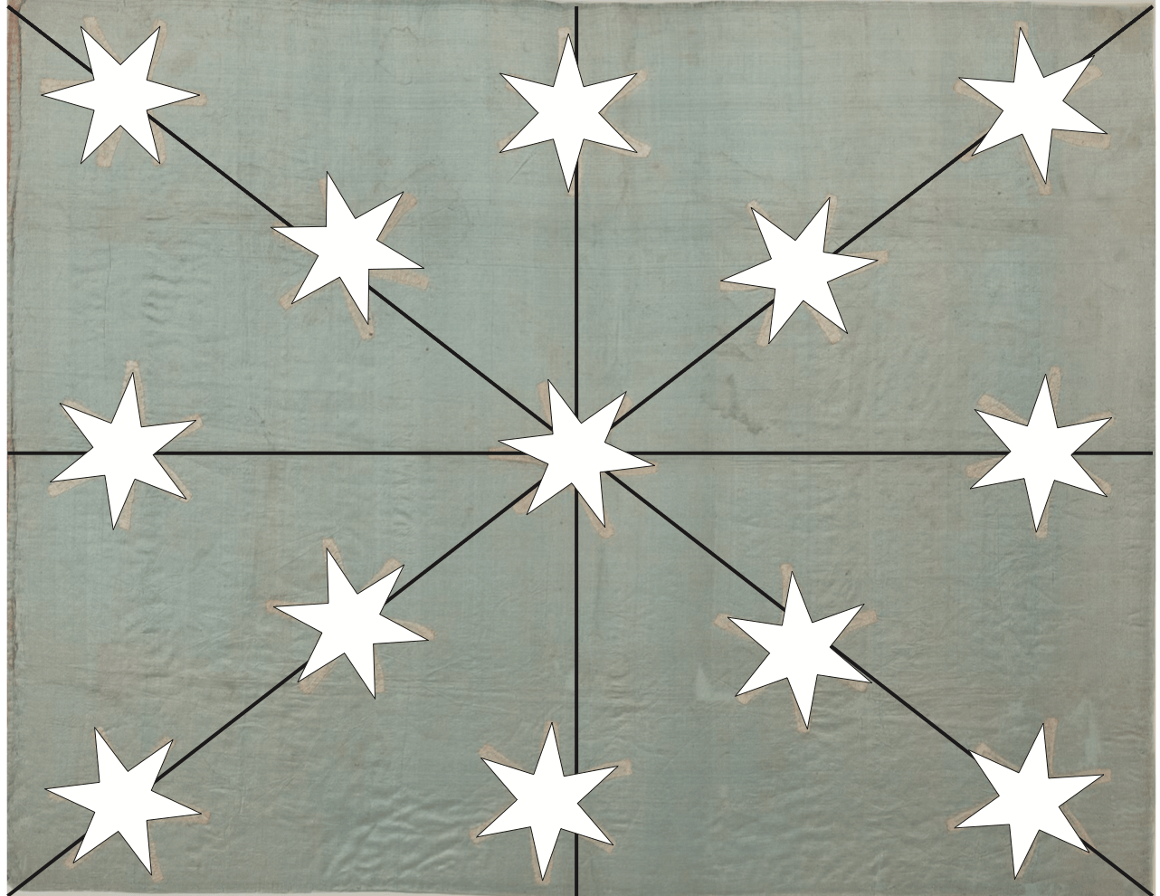
Because I’m who I am, and have my ways of working on a commission– especially on anything involving aesthetics– I shared photographs of the four possible grounds, and of the star samples, with the Museum staff. They selected my recommendations, which I tried to make objectively. It needs to be the client’s decision, but as the maker, I know how the materials behave and have a pretty good sense of how the finished piece will look. It’s my responsibility to recommend what I think will create the desired outcome, but while recognizing that the client has the final say.

You must be logged in to post a comment.