An Unusual Coat

DSCN4288
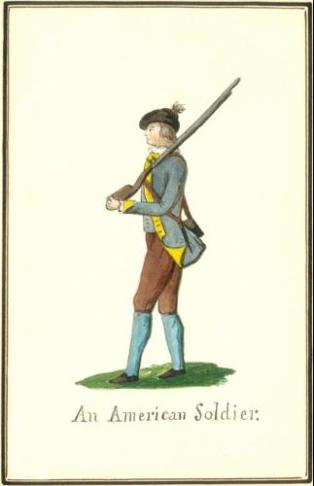
In 1777, the uniforms of the Continental Army remained largely uncodified and, well, non-uniform. At Ticonderoga, German accounts from the spring of 1777 state that “Few of the officers in General Gates’ army wore uniforms, and those that were worn were evidently of home manufacture and of all colors. For example, brown coats with sea-green facings, white linings, and silver dragons(epaulettes or shoulder knots), and gray coats with yellow buttons and straw facings, where to be seen in plenty.”

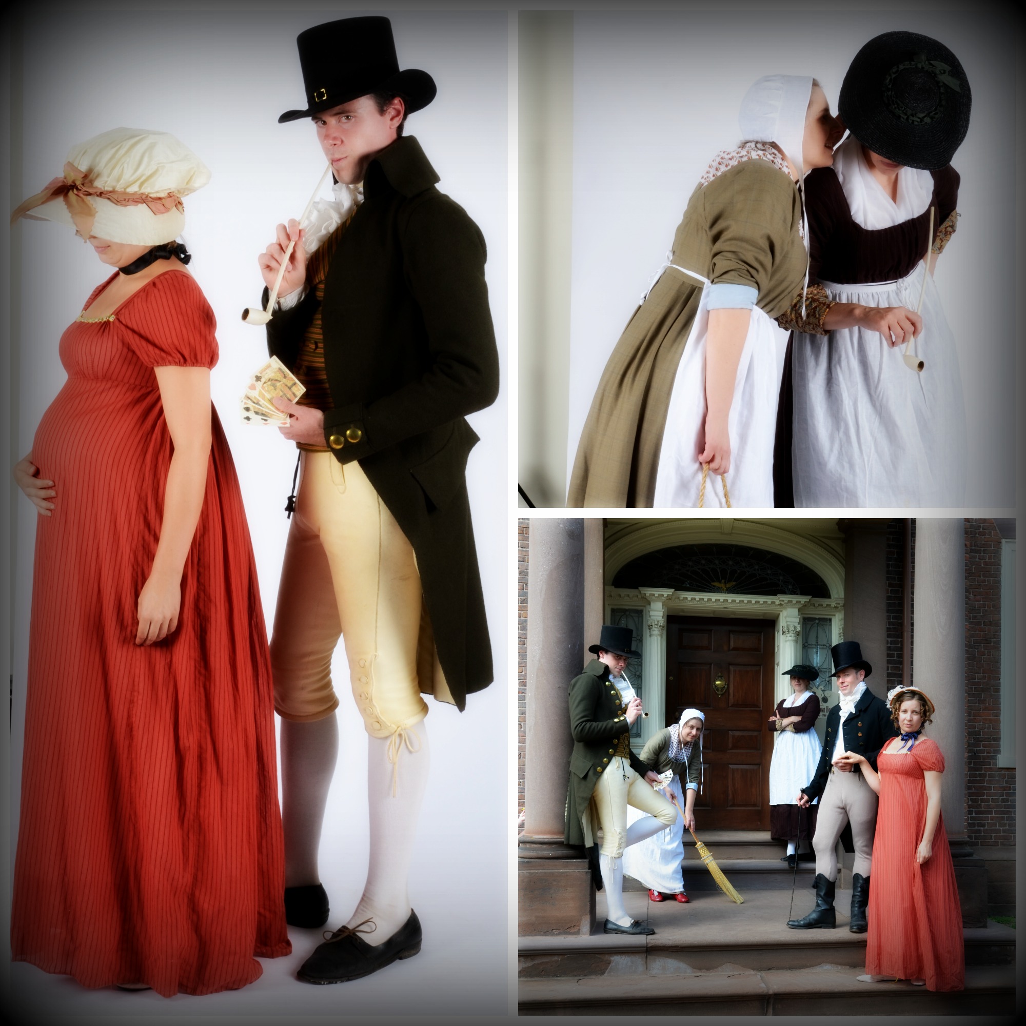
Brown coats with sea green facings. There’s one in our regiment, and it is a lovely thing. The Adjutant thought it would be interesting for the troops to turn out in these coats at Saratoga, an event to which the coat can be documented (being soon after Fort Ticonderoga) and an event that will take place on the historic site. So we’re making them, in a project that started Saturday, and here we are: ready to have the lapel width adjusted, because my eye tells me it is too big, and yes, I’m told that it was cut a but wide. So this morning, a lapel trim is in order.

An American Soldier. ca.1852 copy of a ca.1777 watercolor by Hessen-Hanau Captain Friedrich von Germann. Niedersächsisches Staatsarchiv, Wolfenbüttel, Braunschweig
An American Soldier. ca.1852 copy of a ca.1777 watercolor by Hessen-Hanau Captain Friedrich von Germann. Niedersächsisches Staatsarchiv, Wolfenbüttel, Braunschweig

But really, these coats.

Here you can see the style that we’re making, with applied lapels and shanked buttons, simple turn backs on the front skirts, and flat collars. The cuffs are also applied, non-functioning cuffs that come to a point in front. (Also, documented blue stockings!)

These coats will be worn with overalls, waistcoats and shoes, because we know from John Buss’s letters that the regiment was issued overalls and shoes in the summer of 1777. No visible stockings, sadly.

This is the kind of project I can get pretty stoked about, with its combination of aesthetics and documentation. A coat described in a German diary, made in pettable wool broadcloth that will be unlike anything else on the field? Of course I want to help make that vision real.

Imagine a moment on the field, with these documented coats, so unusual (the sea green may have been a faded blue, but sea green is what was seen), worn in a place where they were worn. I don’t need to remind you about the authenticity/commemoration thing, do I? Because it’s pretty clear that’s what’ll happen three weeks from now in New  York.

You are What You Wear

Kyoto Costume Institute. Right: Robe a l'anglaise, 1790-95, England.
Kyoto Costume Institute. Right: Robe a l’anglaise, 1790-95, England. AC5065 85-3-1

(Part one of a series)
Or do you wear what you are?

Both statements seem true, but what I know is this: dressing for the October 5 event has me stymied.

I am stuck on fabric. Sharon Burnston’s advice last Saturday was very helpful: Think Ralph Earl. She’s right: Earl’s iconic images give you the shape and accessories of southeastern New England dress in the last decades of the 18th century.

The tricky part for me is that Earl’s portraits don’t show you the maid or the housekeeper.

The character I’m playing is interesting to me: she’s invisible but powerful, respectable but not refined, loyal but detached. We don’t need to get into my familiarity with any of these paradoxes, but this might be a comfortable discomfort. What could this have to do with fabric? A great deal, as it happens.

_JDK4293

The first thing I thought I should do was to figure out the “when and why” of my character’s style choices. After talking with Sharon, I thought I understood our characters’ relationship better, and at the very least, what her character would expect of mine. And let me tell you, it is much harder to imagine being a naughty maid when you like and respect your mistress!

But I like my work to be playful: authenticity does not preclude wit, and in the late 18th century, I would argue that authenticity, at some levels, requires wit. So, how does one visually signal respect for one’s employer and playfulness?

Good lord, when is she going to talk about fabric? Right now, that’s when!

With fabric, and with style and fit, that’s how you can signal the respectful/playful combination.

And fabric is where I’ve been stuck. The gown in the photo (aside from some interesting odors and a few unidentifiable splotches) is made of a sober and suitable wool fabric. The sleeves are partially lined with an Indian block print fabric to provide a non-itchy surface and a little contrast. But I think the gown’s style is a little forward for my character as I understand her in relationship to Sharon’s character. It was also made short for working at the farm, and needs a pressing.

Potential yellow linen petticoat with potential block print cotton round gown.

Still, an earlier style in a solid light-weight wool feels a little too sober to me. It feels more like the Fortnightly Dances, and less like me or my character. A possible compromise? Style like Ralph Earl, fabric like the KCI gown.

Thanks to the Strategic Fabric Reserve, I have some black cotton block print yardage and in looking for that, I rediscovered the yellow linen.

BLOCK-PRINTED COTTON British, ca. 1780–90. Cora Ginsburg.
BLOCK-PRINTED COTTON
British, ca. 1780–90. Cora Ginsburg.

Why this particular fabric? Aside from my whimsy and the KCI inspiration, dark grounds come into fashion in the late 1780s, and as a servant, I will lag a bit, style-wise. Could I have a cheaper version of the fabric at left (a child’s dress, 1780-1790, at Cora Ginsburg)? Barbara Johnson’s book at the V&A contains samples of dark ground prints from 1787 on; they’re different the vine-like print at left, but floral prints on black or dark brown are popular in these last decades.

I’m not committed to the black ground gown for this event. I’ve ordered swatches of Burnley & Trowbridge’s new light-weight wools, and we’ll see. Color and hand could convince me, and I can always line the lower part of the sleeves with a cotton print.

The Pleasure of Your Company

WCD Two

Friday afternoon we did a photo shoot at work for promotional materials for our upcoming What Cheer! Day program on Saturday, October 5. We’ll be occupying the house in first person for a day, with members of the Brown family and their servants. I think we’re all a little overwhelmed by the prospect of playing real characters about whom we know less than we’d like, but too much not to pay attention to.

There are a lot of details in building a character, and I’m very lucky to be playing the housekeeper, who really is anonymous. We know the names of some of the servants, but not all. It’s liberating, but it’s also making a character up out of the whole cloth. This just means imagining someone new, and that’s where the aspiring fiction writer in me gets to play.

I’ve written about the process here and here, and there will be more to come. But for now, we request the pleasure of your company on Saturday October 5, where you can learn what secrets those maids know, and find out why the gentleman in the blue coat so hates the man in the green coat.

Thinking Ralph Earl

Mabel Ruggles Canfield. Oil on canvas by Ralph Earl, 1796. Litchfield Historical Societym 1917-04-4
Mabel Ruggles Canfield. Oil on canvas by Ralph Earl, 1796. Litchfield Historical Society, 1917.4.4

In three weeks, I start a three week cycle of events in different decades: Saratoga in 1777 will be followed by Boston in 1763, followed by Providence in 1800. This causes a kind of temporal whiplash, though I know well enough what I should wear for 1777 and 1763, and Mr S’s brown coat will cut out this week so I can begin to sew on Saturday.

Providence in 1800 worries me more, but last Saturday’s conversation with Sharon helped immensely, especially when she said, Think Ralph Earl. So simple, I was embarrassed not to have remembered one of my favorite painters.

I need to think below Ralph Earl’s sitter’s station, but as Mrs Brown’s housekeeper or bossiest maid, these portraits represent the type of people I see, people who live in Providence but aren’t the Browns. Ralph Earl’s world of Connecticut merchants and ministers is much like the world I would see. How much more cosmopolitan was Providence than Stonington or New London? They’re all ports, and Providence is busier, but I think that Ralph Earl is a safe bet for understanding the visual context of the southern New England in the 1790s and the styles people wore.

It is especially helpful because he painted women of about the right age. Mrs Canfield at the top of te page was born in 1760, so she’s just a little younger than my character.

Oiver Ellsworth and Abigail Wolcott Ellsworth. Oil on canvas by Ralph Earl, 1792. Wadsworth Atheneum, 1903.7

Mrs Ellsworth was born in 1756, so she’s a little bit older. Different ages, different styles (yes, styles have also changed between 1792 and 1796). But some constants: long, slim sleeves. White caps and handkerchiefs, layered at the neck. Silk–though that won’t be me–in solid, slightly muted colors.

There’s another Connecticut painter worth looking at: John Brewster, Jr. In this New Republic period, I think it’s really critical to look to American sources for clues to how people projected themselves, how they were seen and wanted to be seen. This is pretty high-falutin’ stuff for a maid, but I’m presuming that I know how to read (because John Brown and his brothers placed an emphasis on education in their own families, and on public education). And if I know how to read, and I work in a house with books and political discussions, chances are good that even in the late 18th century, I have eavesdropped on the discussions and I have read at least the newspapers. I’m living in a certain atmosphere, and how I dress and what I think about will reflect the world around me.

John Brewster and Ruth Avery Brewster. Oil on canvas by JOhn Brewster, Jr. ca. 1795-1800. Old Sturbridge Village.
John Brewster and Ruth Avery Brewster. Oil on canvas by John Brewster, Jr. ca. 1795-1800. Old Sturbridge Village.

Dr. John Brewster, seen here with his second wife, Ruth, descended from William Brewster. His wife, Ruth, is obviously literate. These people are signaling education and sensibility to us: sober, well to do, respectable. Brewster is not as good a painter as Ralph Earl, so fabric is harder to read. What is her gown made of? Could be fine wool, could be silk: hard to tell. But see that little edge of shift peeking below that three-quarter sleeve? That’s old school for 1795. But I like the neckline and the color. Burnley & Trowbridge have a light-weight wool that color…

Mother with Son (Lucy Knapp Mygatt and Son, George), 1799. Oil on canvas by John Brewster, Jr. Palmer Museum of Art, Pennsylvania State University

Brewster’s portrait of Lucy Knapp Mygatt and her son, painted in 1799, does, I think, help push the date for the Brewster double portrait earlier: by 1799, the painter in more accomplished and bolder in the full-length portrait. He’s also learned to render fabric somewhat more convincingly.

Long sleeves, white cap and kerchief, high waistline: the styles are consistent, but as you move through the subtleties of class, the expression of the style shifts. Front-closing round gown with a waistline that’s high, but lower than what I’ve made in the past, with long sleeves: settled. Now all I need to decide upon is fabric: probably a lightweight, dark-colored wool, though I haven’t found exactly what I want yet.