Animal Apples

apple-tree-056fb57ed927bf3668ef04e5b9850e99363b87fe-s6-c30The neighborhood where we live is part of the old rural past of our college town: it’s up the hill from the oldest settlement area, and slopes downhill to a plateau that runs out towards the other river, where the land drops precipitously. The house we live in was built in the 1920s, about the time of the junior high school and the stadium below us. The streets are named for the people who settled and farmed here, and two of the early houses remain, one frame and one stone.

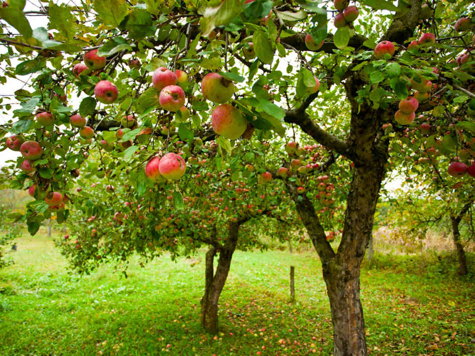
Even into the 1940s, there was a dairy farm in this area, and a milk wagon; paintings from the first quarter of the twentieth century show an orchard named for one of the settlers, and there’s possible physical evidence of an earlier existence: apple trees in the verge around the corner from us.

I don’t know if these are new trees or old, though apple trees can live a long time. Well established and productive, the apples look like Paula Reds, but then again, so do Devonshire Quarrendens. (Paulas are a 1968 apple introduction, based on McIntosh apples.) What I do know is that they’re early season and good for eating, though we don’t like to pick too many: it feels like stealing, though no one ever seems to picks them. Mr S finally heard why: they’re Animal Apples.

1-squirrel-apple

A man and his son were on bikes at the corner under the tree; the man told his son the apples were not for eating: “Those aren’t for people. Those are animal apples.

Those apples are delicious, and if it didn’t feel like stealing, I’d go up there with a basket. So many go to waste, and I suppose it’s because people have this “animal apple” idea.

There’s good foraging in the city, if you look, blackberries and raspberries in scrub ground, the apple trees, and the lettuce I let go to seed that flourished in the cracks of the walk down the side of our house. The idea that apples on a city tree aren’t for people  is sad. I ate mulberries off the tree in our yard in Chicago, where we grew rhubarb in the yard that fronted a busy street.

I don’t know what I find most disturbing about Animal Apples: the possibility that we’re so far removed from food that people can’t tell the difference between eating apples and ornamental apples, or that we’re so far from where our food originates that we fear anything that’s not assembled, processed, or obviously tamed and presented for our consumption.

‘Visual Arts Crush’

I’ve been following the Times’ Arts Crush” series, and one of the best, and best-written, in the series has been Holland Cotter’s piece on poetry and the MFA. Cotter’s writing is always elegant and accessible, with an amazing ability to render high concepts simply. (I wish he’d taught my graduate seminars in art theory…) The series inspired me to think about my first visual arts crush, and how it still resonates today.

I grew up on the North Side of Chicago, in the actual city, not Ferris-Bueller-land. By the time I was in high school, I had a pretty free-range existence thanks to the Chicago Transit Authority, and rode the bus anywhere and everywhere, even up to the southern edge of Bueller-land, also known as Evanston.

Mrs. James Ward Thorne American, 1882-1966 A17: Pennsylvania Kitchen, 1752, c. 1940. Art Institute of Chicago
Mrs. James Ward Thorne
American, 1882-1966
A17: Pennsylvania Kitchen, 1752, c. 1940. Art Institute of Chicago

Thanks to the CTA, and to the car my family drove only on weekends, and plenty of field trips in school, we visited most of the museums in the city: the Museum of Science and Industry, the Shedd Aquarium, the Chicago Historical Society, the Field Museum and the Art Institute of Chicago. That’s where I found my very first crush.

Mrs. James Ward Thorne American, 1882-1966 A3: Massachusetts Dining Room, 1720, c. 1940. Art Institute of Chicago.
Mrs. James Ward Thorne
American, 1882-1966
A3: Massachusetts Dining Room, 1720, c. 1940. Art Institute of Chicago.

There’s a lot to love in the AIC, from classic Impressionists to post-war Abstract Expressionists, but when I was in grade school, what really made an impression on me were the Thorne Rooms. The Thorne miniature rooms are meant to be the most accurate 1/12 scale representations of historical interiors. It will not surprise you that I pressed my 10-year-old nose against the glass of the early Pennsylvania rooms, or the high-style Rhode Island rooms, wishing desperately that I could shrink and slip through that solid membrane and inhabit the world the rooms depicted.

Mrs. James Ward Thorne American, 1882-1966 A11: Rhode Island Parlor, c. 1820, c. 1940. Art Institute of Chicago
Mrs. James Ward Thorne
American, 1882-1966
A11: Rhode Island Parlor, c. 1820, c. 1940. Art Institute of Chicago

My mother and I would play a game: Which is your favorite room? Which one would you like to live in? And even if the rooms filled with tiny ball-and-claw feet were my favorite, or the chestnut-panelled keeping rooms, the one I wanted to live in (because somewhere there would be a telephone and a radio, and behind the tiny door, a well-appointed bathroom) was the Art Deco apartment. We were fairly certain this was a room you never saw in “Bringing Up Baby,” maybe the room on the other side of the bathroom where the leopard was kept.

Mrs. James Ward Thorne American, 1882-1966 A37: California Hallway, c. 1940, c. 1940. Art Institute of Chicago.
Mrs. James Ward Thorne
American, 1882-1966
A37: California Hallway, c. 1940, c. 1940. Art Institute of Chicago.

Accuracy and anarchy: those contradictory impulses have guided most of my life, from the work I made as an artist, to the work I do now. Getting details right, from citations to what’s on a table for a 1799 tea, matters; but once that’s set in motion, life takes over, the metaphorical leopard is loose, and we’re off to see what life was really like in all its emotive glory in 1799.

Mrs. James Ward Thorne American, 1882-1966 E-15: English Drawing Room of the Modern Period, 1930s, c. 1937. Art Institute of Chicago.
Mrs. James Ward Thorne
American, 1882-1966
E-15: English Drawing Room of the Modern Period, 1930s, c. 1937. Art Institute of Chicago.

And it all started in the basement of the Art Institute of Chicago, imagining what it would be like to live in each of the tiny worlds that ring the walls of the Thorne Rooms gallery.

Hunting Frocks, Again

They’re not Mr S’s favorite thing, and I can understand why. Hunting frocks lack pizzazz, buttons, tape, lace, lapels, skirts and all the things that make him so fond of the Ugly Dog Coat worn by the 10th Massachusetts in 1782. (I think these are the coats captured from British supply ships and dyed at Newburgh and West Point in tanner’s vats.) But what he has right now is a hunting frock.

Here’s the kid in his new hunting frock, and a hand colored copper engraving by Johann Martin Will from 1776.

You gotta hold your tongue just right when you drill.
Americaner Soldat, Johann Martin Will. Ann S. K. Brown Collection, Brown University.

And then there are the colored and plain engravings, “1. Americanischer scharffschütz oder Jäger (rifleman) 2. regulaire infanterie von Pensylvanien,” engraved by Berger after Chodowiecki.

 Library of Congress
Library of Congress
Berger after Chodowiecki, Ann S. K. Brown Military Collection, Brown University
Ann S. K. Brown Collection

I started thinking about these again because not only am I reading Hurst’s thesis, but I’m fresh from helping the guys get dressed and arrange their capes and straps. I have been doing that as long as Mr S has been wearing historic clothing.

Early days of draping

Drapey capes

The hunting frock drifts if it does not have some kind of fastening at the neck. The two halves migrate in opposite directions, and while belts help, the light infantry bayonet shoulder belt does not contain the hunting frock as well as one might like. So the thing to do, I think, is to attach a loop and button at the neck to hold the garment in place. From the period engravings, I think that’s acceptable. The garments all look as if they are closed at the neck. From the evidence in the field, and from the images, I plan to make loops and attach buttons, and hope that will limit some tendency to wander.

The image of the two soldiers together suggests another wrinkle in the hunting frock quandary, since the left hand soldier’s out garment looks like a long pocket-less coat with applied fringe and only a very small cape at the neck. Thank goodness that soldier is a rifleman, and thus outside the realm of immediate relevance. (And on a side note, I know a gentleman who very much resembles the Pennsylvania infantry man: identical calves, and even a similar face.)

D-Day: Robert Capa

Robert Capa, American, b. Budapest 1913 - d. Indochina 1954
Robert Capa, American, b. Budapest 1913 – d. Indochina 1954 © International Center of Photography

Once upon a time in the Midwest, I worked in a Department of Photographs and Prints. (That’s where I met Mr S, when he was hired as the first museum Photographer, though he was initially known as the Badger in the Basement for the tenacity with which he defended his studio.)

I am fortunate to have a visual memory, and that’s part of how I got my job, and part of how I got to be an Assistant, and then a full, Photo Editor of the museum’s magazine. I love images, and I love photography, and I suppose I must love photographers, too, since there’s one around here somewhere in this place that I call home.

FRANCE. Normandy. June 6th, 1944. Landing of the American troops on Omaha Beach. Robert Capa, International Center of Photography
FRANCE. Normandy. June 6th, 1944. Landing of the American troops on Omaha Beach. © Robert Capa © International Center of Photography

One of the best assignments was photo editing an article based on the World War II diary and service of a local doctor who served in the Army infantry. He wasn’t the most enlightened or unbiased man, but in the 1940s, I suppose that was sadly normal. I read the piece for placement and image ideas, not for tone or subtlety. North Africa, Monty, Casserine, Messina, Easy Red and Omaha: that’s what I underlined.

My go-to for WWII photography was Robert Capa first and last. There’s Blood and Champagne, but the book I read first was Slightly Out of Focus. It was written by Capa, just as he wrote Images of War. (I discovered these killing time on summer weekends in the air-conditioned fine art reading room of the downtown public library.) Capa did not love war, even as he thrived in the combat photography environment, and said, “If your photographs aren’t good enough, you’re not close enough.” But he also noted, like Cartier-Bresson, that you had to like people to take good photographs of them.

His images are dark: not just the imagery, but the prints themselves. A well-printed Capa has deep, rich, dark tones (D-Day images excepted, thanks to a horrendous processing error), and even decades later, a vintage Capa print has magic.

I called Magnum, back in the days when one called, described what I had seen, cited the books I’d read, listed what I wanted prints of to use in the magazine. I think I knew enough to get a little more: vintage prints of images I hadn’t seen. They arrived, sandwiched in cardboard, in a FedEx envelope.

TALY. Near Troina. August 4-5, 1943. Sicilian peasant telling an American officer which way the Germans had gone. Robert Capa, International Center of Photography
TALY. Near Troina. August 4-5, 1943. Sicilian peasant telling an American officer which way the Germans had gone. R © Robert Capa © International Center of Photography

There were photos like this one, and one of a soldier shaving, using his helmet as a basin. There were images I’d seen, and some I had not. They were dark, and sympathetic, and captured the war and humanity as no other images I’ve seen have ever done.

His portfolio was huge, and includes not just war photography, but fashion and film and humorous photos, too. Holding one of his prints–or at least a print made close to the time when he had shot the negative, and might have been alive–was as close as I was ever going to get to meeting Robert Capa. For all he lived through–escaping Fascism, documenting the Spanish Civil War, the Rape of Nanking, the Blitz, all of World War II– Robert Capa died after stepping on a land mine on the road to Thai Binh in what was then French Indochina.

INDOCHINA. May 25, 1954. Vietnamese troops advancing between Namdinh and Thaibinh. This is one of the last pictures taken by Robert Capa with his Nikon camera before he stepped on a landmine and died at 14.55. © Robert Capa © International Center of Photography

It seems so sad, and yet one has to remember that he died working, doing not just what he loved–taking photographs–but what he had to do. He didn’t love war, but he loved people. The beauty of the images he made almost undoes their purpose, in recording war’s horrors, but the real affection for people that comes through in those contrasty prints redeems the violence, I think, giving us sympathy for the people uprooted, displaced, used and abused by war, whether soldier or civilian. Through that love,Capa found courage and we can find truth. Keep looking: there is more to see.