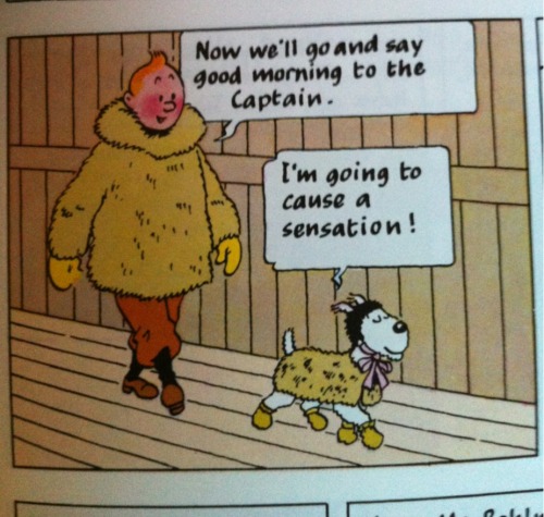
The Shooting Star: Snowy in his “best bib and tucker.”
Chemisette or tucker? By the time The Shooting Star was published in 1941-42, “bib and tucker” had wandered away from their original meanings. Tuckers were worn under women’s and girl’s bodices, taking on the role of neck handerchiefs or fichus, and what some people like to call “modesty pieces,” though the phrase always makes me think of the front panel of desks.
Turns out you probably can. Scrolling through the miniatures gallery, there was Hannah Weaver Peckham in her best tucker, and Miss Rhodes, while later, is also sports a chemisette or tucker. (Mrs Peckham looks a bit cranky, doesn’t she? Perhaps her busk is poking her.)
What you’d call it remains an open question.
The 1933 Oxford dictionary we have in the office defines “tucker” as “A piece of lace or the like, worn by women within or around the top of the bodice of the 17-18th C.”
Phoebe Smith Rhodes, RIHS 1918.3.6
The same dictionary tells me “chemisette” is 1807, from the French, diminutive of chemise. “1. A bodice, more or less like the upper part of a chemise. 2. An article, usually of lace or muslin, made to fill in the open front of a woman’s dress 1844.”
While I think that one could, in Rhode Island in 1800, wear a garment that filled in the upper part of a bodice, I’m not sure what one wold call that garment. The simplest thing to do is to wear a white kerchief like Phoebe Smith Rhodes. Have I ever settled for the simplest thing? Not if I can help it.
Part two of a series Mrs Garnett, Housekeeper, oil on canvas by Thomas Barber. NTPL Ref. No. 42286
I’m minding my own business checking out my friends’ business on Facebook, when Mrs Garnett appears on Joanna Waugh’s blog. Mrs Garnett had been rattling around in my head as “Wait, there’s that housekeeper painting, and she’s got, like, this great bonnet…” which is the art historical equivalent to an ear worm.
Yes, the Kedleston Hall housekeeper. A bit grand for Mr and Mrs Brown, if you compare a fine mansion in Providence to a English County House with a Collection and its Own Catalog, but not too grand if you compare John Brown’s House to Jeremiah Dexter’s, or Stephen Hopkins’.
We are talking about a man who asked his son-in-law to fetch back marble busts from Versailles, during the time of the French Revolution when the scent of blood was, literally, in the air. Mr Brown had pretensions.
This is tough to hang on to because I see that house every week and it is now so familiar that I don’t see it: it’s background. This is both good and dangerous: I need to hold on to the magic and mystery of the overwhelming high style decorative arts of the house, while also feeling ownership and pride in that house. The catch is that the meaning is so different to me now than it would have been to me then. Though to be honest, being a curator is not so different from being a housekeeper. Curator has its roots in the Latin “cura,” to care, and in that root lies the similarity of roles.
So I will care for the house, and care how I represent it: those are keys, I think, that, as Sharon Burnston says, point to a solid, sober-colored worsted. She referred me to the Francis Wheatley “Cries of London” series, which you may recall from earlier posts.
Again, it is hard to shake the familiarity with the street vendor/woman of the army/runaway apprentice chaser I am accustomed to being. But I think the solution to my desire for playfulness lies in thinking closer to 1800 in style, and in a contrasting petticoat. Also, a bonnet. You can never have too many bonnets.
But this is academic, in a way, until I get my fabric samples. I shall will myself to patience, and instead keep sewing the Wasmus Coat for Saratoga. Yes, I realize my idea of a brown gown and pale blue petticoat will replicate the contrast of the coat body and facings. But I do really love those coats!
Kyoto Costume Institute. Right: Robe a l’anglaise, 1790-95, England. AC5065 85-3-1
(Part one of a series)
Or do you wear what you are?
Both statements seem true, but what I know is this: dressing for the October 5 event has me stymied.
I am stuck on fabric. Sharon Burnston’s advice last Saturday was very helpful: Think Ralph Earl. She’s right: Earl’s iconic images give you the shape and accessories of southeastern New England dress in the last decades of the 18th century.
The tricky part for me is that Earl’s portraits don’t show you the maid or the housekeeper.
The character I’m playing is interesting to me: she’s invisible but powerful, respectable but not refined, loyal but detached. We don’t need to get into my familiarity with any of these paradoxes, but this might be a comfortable discomfort. What could this have to do with fabric? A great deal, as it happens.
The first thing I thought I should do was to figure out the “when and why” of my character’s style choices. After talking with Sharon, I thought I understood our characters’ relationship better, and at the very least, what her character would expect of mine. And let me tell you, it is much harder to imagine being a naughty maid when you like and respect your mistress!
But I like my work to be playful: authenticity does not preclude wit, and in the late 18th century, I would argue that authenticity, at some levels, requires wit. So, how does one visually signal respect for one’s employer and playfulness?
Good lord, when is she going to talk about fabric? Right now, that’s when!
With fabric, and with style and fit, that’s how you can signal the respectful/playful combination.
And fabric is where I’ve been stuck. The gown in the photo (aside from some interesting odors and a few unidentifiable splotches) is made of a sober and suitable wool fabric. The sleeves are partially lined with an Indian block print fabric to provide a non-itchy surface and a little contrast. But I think the gown’s style is a little forward for my character as I understand her in relationship to Sharon’s character. It was also made short for working at the farm, and needs a pressing.
Still, an earlier style in a solid light-weight wool feels a little too sober to me. It feels more like the Fortnightly Dances, and less like me or my character. A possible compromise? Style like Ralph Earl, fabric like the KCI gown.
Thanks to the Strategic Fabric Reserve, I have some black cotton block print yardage and in looking for that, I rediscovered the yellow linen.
BLOCK-PRINTED COTTON British, ca. 1780–90. Cora Ginsburg.
Why this particular fabric? Aside from my whimsy and the KCI inspiration, dark grounds come into fashion in the late 1780s, and as a servant, I will lag a bit, style-wise. Could I have a cheaper version of the fabric at left (a child’s dress, 1780-1790, at Cora Ginsburg)? Barbara Johnson’s book at the V&A contains samples of dark ground prints from 1787 on; they’re different the vine-like print at left, but floral prints on black or dark brown are popular in these last decades.
I’m not committed to the black ground gown for this event. I’ve ordered swatches of Burnley & Trowbridge’s new light-weight wools, and we’ll see. Color and hand could convince me, and I can always line the lower part of the sleeves with a cotton print.
Mabel Ruggles Canfield. Oil on canvas by Ralph Earl, 1796. Litchfield Historical Society, 1917.4.4
In three weeks, I start a three week cycle of events in different decades: Saratoga in 1777 will be followed by Boston in 1763, followed by Providence in 1800. This causes a kind of temporal whiplash, though I know well enough what I should wear for 1777 and 1763, and Mr S’s brown coat will cut out this week so I can begin to sew on Saturday.
Providence in 1800 worries me more, but last Saturday’s conversation with Sharon helped immensely, especially when she said, Think Ralph Earl. So simple, I was embarrassed not to have remembered one of my favorite painters.
I need to think below Ralph Earl’s sitter’s station, but as Mrs Brown’s housekeeper or bossiest maid, these portraits represent the type of people I see, people who live in Providence but aren’t the Browns. Ralph Earl’s world of Connecticut merchants and ministers is much like the world I would see. How much more cosmopolitan was Providence than Stonington or New London? They’re all ports, and Providence is busier, but I think that Ralph Earl is a safe bet for understanding the visual context of the southern New England in the 1790s and the styles people wore.
It is especially helpful because he painted women of about the right age. Mrs Canfield at the top of te page was born in 1760, so she’s just a little younger than my character.
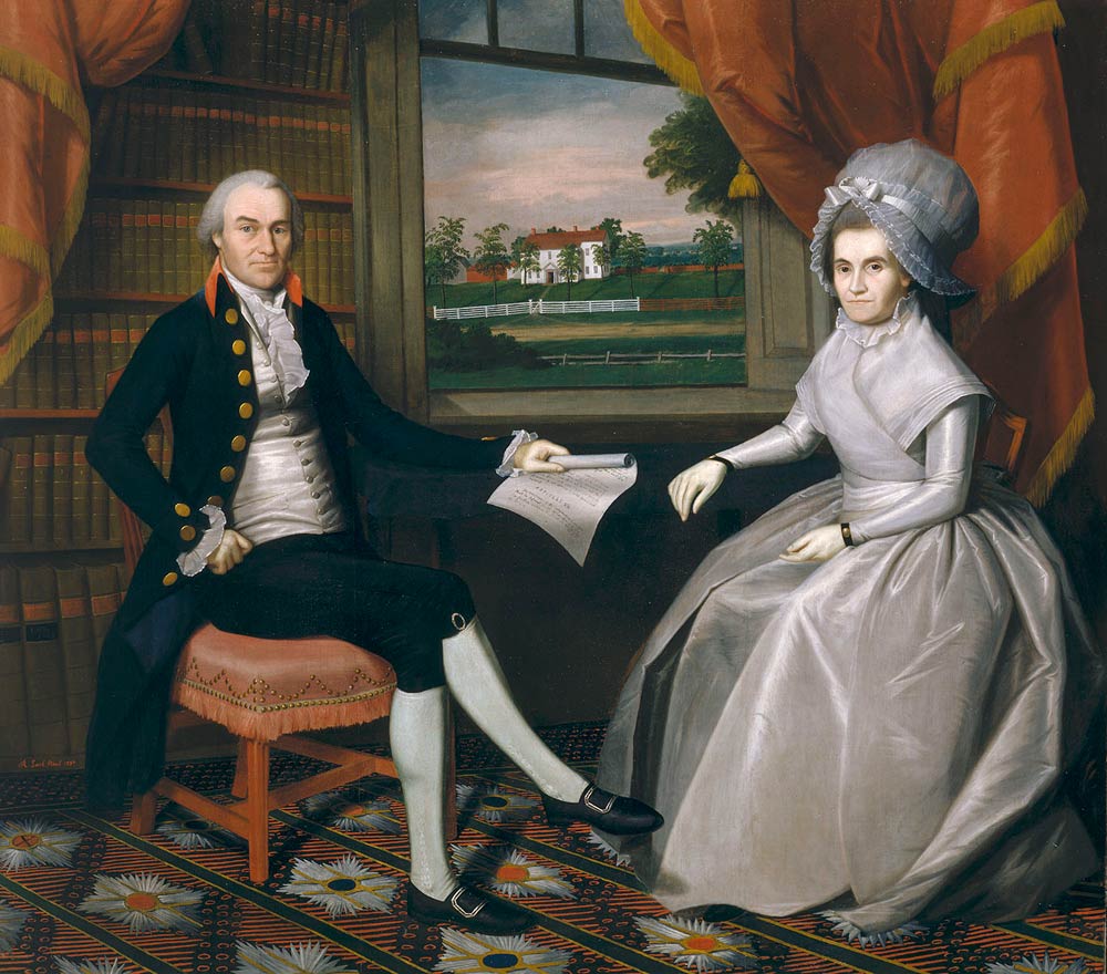
Oiver Ellsworth and Abigail Wolcott Ellsworth. Oil on canvas by Ralph Earl, 1792. Wadsworth Atheneum, 1903.7
Mrs Ellsworth was born in 1756, so she’s a little bit older. Different ages, different styles (yes, styles have also changed between 1792 and 1796). But some constants: long, slim sleeves. White caps and handkerchiefs, layered at the neck. Silk–though that won’t be me–in solid, slightly muted colors.
There’s another Connecticut painter worth looking at: John Brewster, Jr. In this New Republic period, I think it’s really critical to look to American sources for clues to how people projected themselves, how they were seen and wanted to be seen. This is pretty high-falutin’ stuff for a maid, but I’m presuming that I know how to read (because John Brown and his brothers placed an emphasis on education in their own families, and on public education). And if I know how to read, and I work in a house with books and political discussions, chances are good that even in the late 18th century, I have eavesdropped on the discussions and I have read at least the newspapers. I’m living in a certain atmosphere, and how I dress and what I think about will reflect the world around me.
John Brewster and Ruth Avery Brewster. Oil on canvas by John Brewster, Jr. ca. 1795-1800. Old Sturbridge Village.
Dr. John Brewster, seen here with his second wife, Ruth, descended from William Brewster. His wife, Ruth, is obviously literate. These people are signaling education and sensibility to us: sober, well to do, respectable. Brewster is not as good a painter as Ralph Earl, so fabric is harder to read. What is her gown made of? Could be fine wool, could be silk: hard to tell. But see that little edge of shift peeking below that three-quarter sleeve? That’s old school for 1795. But I like the neckline and the color. Burnley & Trowbridge have a light-weight wool that color…
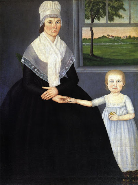
Mother with Son (Lucy Knapp Mygatt and Son, George), 1799. Oil on canvas by John Brewster, Jr. Palmer Museum of Art, Pennsylvania State University
Brewster’s portrait of Lucy Knapp Mygatt and her son, painted in 1799, does, I think, help push the date for the Brewster double portrait earlier: by 1799, the painter in more accomplished and bolder in the full-length portrait. He’s also learned to render fabric somewhat more convincingly.
Long sleeves, white cap and kerchief, high waistline: the styles are consistent, but as you move through the subtleties of class, the expression of the style shifts. Front-closing round gown with a waistline that’s high, but lower than what I’ve made in the past, with long sleeves: settled. Now all I need to decide upon is fabric: probably a lightweight, dark-colored wool, though I haven’t found exactly what I want yet.


You must be logged in to post a comment.