Francois-Robert Ingouf after Sigmund Freudenberger (French, 1747 – 1812 ), La soiree d’hyver, 1774, etching and engraving, Rosenwald Collection 1943.3.4377
Details. It’s all in the details, right? I see this print multiple times every day, and contemplate the little stories in the details of the room.
Francois-Robert Ingouf after Sigmund Freudenberger (French, 1747 – 1812 ), La soiree d’hyver, 1774, etching and engraving, Rosenwald Collection 1943.3.4377
Perhaps the first thing I noticed that jarred my eye (and my thinking) was the row of glass vases for forcing bulbs. They look so modern, don’t they? But the shape is classic– form following function– and findable today. How pleasing that my mother’s winter ritual of filling windowsills and mantles with forcing bulbs can be visually documented to one of my favorite eras–and was, indeed, common in the past. This is one of those “everybody did it” ideas I can endorse.
French François Linke Louis XVI Style Gilt Bronze and White Marble Clock
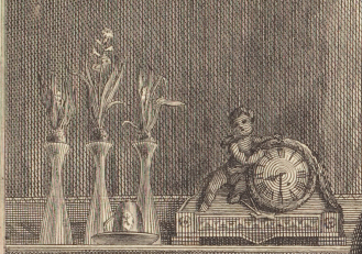
Francois-Robert Ingouf after Sigmund Freudenberger (French, 1747 – 1812 ), La soiree d’hyver, 1774, etching and engraving, Rosenwald Collection 1943.3.4377
What else is on the mantle? A clock, undoubtedly ormolu– though it could be much worse. And yes, the cupid on the clock has meaning in this print.
And then there’s this: the hot water urn– or is it?
Tucked into the fire place, I was initially pretty sure that’s a hot water/tea/coffee urn, meant to go with the tea or coffee cup on the mantle (see above; it’s in front of the bulb vases). Hot tea or coffee would be welcome on a cold winter’s evening, and the water would stay warmer tucked close to the fire.
Francois-Robert Ingouf after Sigmund Freudenberger (French, 1747 – 1812 ), La soiree d’hyver, 1774, etching and engraving, Rosenwald Collection 1943.3.4377
Tea urn. Silver, by John Carter II. 1773-1774. Metropolitan Museum of Art, 11.28a–f
18th Century Cast and Wrought Iron Fireplace Fire Grate
But it could also be a decorative fender, ornamented with urns at the ends. The fireplace grate shown here is English, made ca. 1780 according to the seller) but should you have space cash burning a hole in your pocket, there’s a similar 19th century reproduction of the one in the print for sale on the interwebs, should you care to recreate this image (I know some of you have the clothes). In fact, there are quite few fenders-with-urns, once you start looking, some in bronze and some in steel.
And what of this? Is that an 18th century dog house or covered dog bed? Yes, it is.
Dog kennel, by Claude I Sené, 1775-1780. Metropolitan Museum of Art, 1971.206.18
The bouillotte candlestand on the table is another nice household detail, illuminating a book lying open on the table set against the wall.
It has taken me some time of looking at period images to accept these candle stands as correct, since my experience with them was grounded in electrified reproductions in suburban Colonial Revival dens and family rooms– a location I will admit I was prejudiced against to begin with, having grown up in a city surrounded by architects devoted to (and buildings by) Mies van der Rohe.
But therein lies the point of looking: what initially seems absurd (Versailles-quality dog beds) or simply anachronistic (candlestands with shades) slides into place when seen and understood, within its proper context.
We all love things, don’t we? Things in the literal, corporeal, piled-in-a-heap sense: plates, shoes, books, chairs, necklaces, models. But what makes us love them? How deeply do we really love them?
Someone posed the questions, What would you take if you had to pack in a hurry to leave home forever? What will your kids remember you by?
Those are hard to unpack: how will other people remember us? Often, we have no idea what we mean to other people, even the ones closest to us. It’s easier for me to know what I would take or keep to remember someone else by– a single sleeve link; a wooden train engine; a stainless steel spoon; a necklace of handmade beads. None of those things reflects what is truly meaningful to me about them, that is, without my knowledge, these aren’t particularly interesting or aesthetic objects. What makes them special is the story I attach to them.
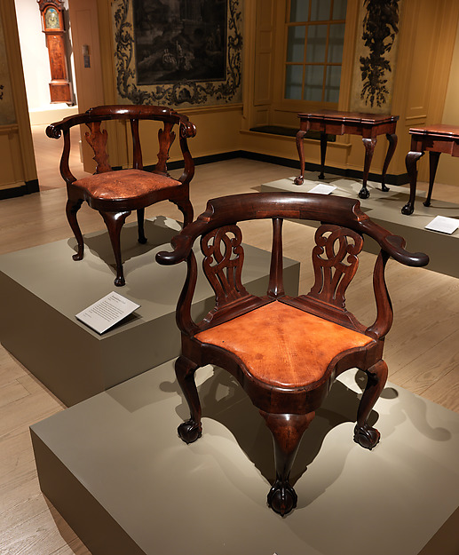
That is, of course, the key to interpreting objects in a social history context: the story is what makes the object more interesting, more important, more compelling. It’s the difference between a provenanced and an unprovenanced object, between a roundabout (or corner) chair in context, and one out of context.
Corner chair, probably John Goddard. Metropolitan Museum of Art, L2014.9.1a,b Lent by the Wunsch Collection, 2014
This is not to say that beautiful things are without value removed from context, but what makes that Goddard chair more compelling is knowing who made it, who it was made for, and when– knowing that it was part of a set of furniture ordered to furnish a house for Providence newlyweds, made in Newport by one of the hottest makers of the time. It’s the people who make the object more interesting, who make it worth having, seeing, holding on to– whether it’s a $6 million chair or a $25 mug, memories and stories make things compelling beyond our associations with them.
Part of a museum curator’s job is understanding those stories, placing objects in context, and connecting them back to their stories, to their makers, users, owners, and keepers. We may buy things because they’re beautiful or useful, but often we keep them because of their meaning– which is, more often than not, about people. Unprovenanced objects have less meaning; an object sold outside, or without, its context will not fetch as much. Value resides in people, not in things.
I think of this not only because a portion of my work is to recreate or reestablish the human contexts and connections for things, but because there is a human instinct to grab onto something tangible (like an object), rather than something ethereal (like a memory), even though what will sustain us in the end is not things, but other people, and our memories of them.
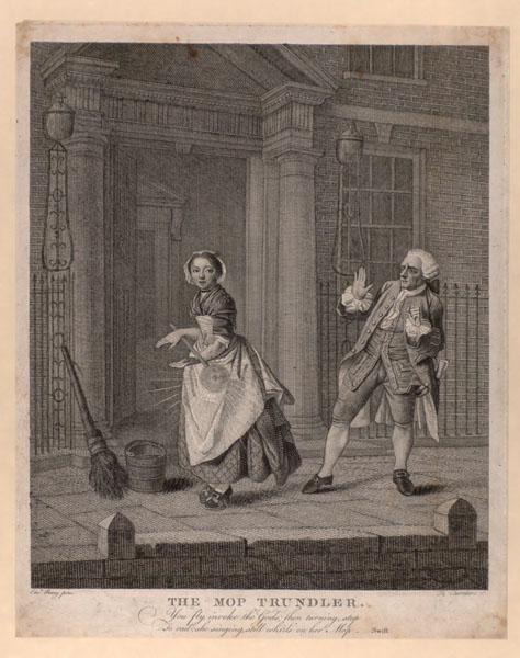
The mop trundler. Chambars after Penny. Bodleian Library, University of Oxford: John Johnson CollectionPhoto by J. D. Kay, 2013
I love this image, and the original on which it is based. I love it so much that we’ve recreated it (in a later time period) whilst fooling about during a photoshoot.
But what does it really show? The image in the print depicts a passage in Jonathan Swift’s poem, A Description of a City Shower,
Such is that sprinkling which some careless quean
Flirts on you from her mop, but not so clean:
You fly, invoke the gods; then turning, stop
To rail; she singing, still whirls on her mop.
Here, in the Macaroni Provider, we have what is “Probably a portrait of some (alleged) notorious procurer; perhaps Thomas Bradshaw whose portrait he somewhat resembles.” We have a pimp, folks.
The Macaroni Provider / Macaronies, Characters, Caricatures & designed by the greatest personages, artists &c graved & published by MDarly, 39 Strand. 1772 (Vol.3). British Museum
So, with this information in hand, let’s look again at The City Shower. We have a maid– one of the few classes of women found in city streets unaccompanied, and a class of women often associated with prostitution (along with street vendors and market sellers). The fashionably dressed man recoils from the spray from her mop– is he rejected the literal filth, or the implied filth of a “maid of all work,” who may have a venereal disease? Is it reasonable to wonder if Swift is using double entendres in the lines Such is that sprinkling which some careless quean
Flirts on you from her mop, but not so clean, so that the mop is the woman’s pubic hair, and not so clean suggests she is diseased?
I don’t know, and absent intensive research or a time machine, I may never know. But once again I wonder how we use and understand these images, and think that they pose more questions than answers. McCreery’s book (based on her dissertation) helps get at some of these issues, and is well worth a read. (I found the Amazon review hilarious, myself, once I had the book in hand. No, it’s not a compendium of prints; it’s an analysis.)
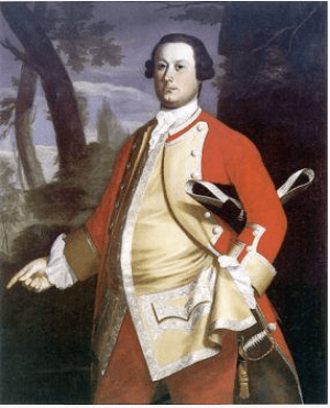
“Hanging in his quarters at Fort Lawrence, Winslow’s portrait in uniform would have served as a subtle reminder of his valuable connections. Copley’s three-quarter-length portrait lavishes attention on the young officer’s silver lace and pulsing red coat, a uniform more elaborate than the one he likely wore. The painter seemingly delights in the play of light upon shining surfaces, from the buff-colored sateen pulled taut across Winslow’s ample waist to the golden braid and tassel dangling from his silver-hilted sword.” (pp 56-57; emphasis added.)
1760-65 Uniform of Captain Thomas Plumbe of the Royal Lancashire Militia.I missed that bit about sateen last night when I read this aloud to Drunk Tailor, so let’s roll back to the part that first set me off: the young officer’s silver lace and pulsing red coat, a uniform more elaborate than the one he likely wore.
Granted, Plumbe’s uniform is later than Winslow’s portrait, and Plumbe was a Captain and Winslow a Lieutenant, but the difference between them is rather less than, say, a private and a captain. Why does Kamensky assume that Winslow’s uniform is not the one he wore? Is it the lace? Winslow held a commission, and served as paymaster and commissary, roles Kamensky describes as “relatively modest.” Yes, Lieutenant isn’t Colonel; it’s the baby of officers, but it’s still commissioned officer and reasonably responsible (and, one might imagine, relatively remunerative if one was hooked into the Boston mercantile network). And uniforms were ornamented with tape, in gold, silver, or wool– see below, in Morier’s painting of two privates. (I further wonder whether it’s reasonable to describe a portrait of 50″ x 40″ as subtle, but perhaps it was placed in an enormous room.)
William Brattle, oil on canvas by John Singleton Copley, 1756. Harvard Art Museums/Fogg Museum, Partial Gift of Mrs. Thomas Brattle Gannett and Partial Purchase through the generosity of Robert T. Gannett, an Anonymous Donor and the Alpheus Hyatt Purchasing Fund 1978.606Fanciful? Fancy to our eyes, yes. Fanciful, no. Brattle was eventually a Major-General, so the uniform portrayed here, when he was likely a captain (same rank as Plumbe), seems pretty reasonable. If we were considering replicating a Massachusetts officer’s uniform ca 1755, we would consider Brattle and Winslow’s biographies and ranks, compare the two portraits of two men, probably both captains at this time, and, cross-referenced with Plumbe’s amazingly extant uniform and the 1751 warrant, begin to form an opinion that we would be making a coat in scarlet superfine broadcloth faced with buff, with buff small clothes, gold tape, and domed buttons. (Sateen is a weave structure, and wool sateen was not used in military uniforms.)
But that’s now how Kamensky is approaching this, of course, and why would she? She’s a historian, not a curator, material culture person, or a reenactor. Why does she assert that the uniforms worn by Winslow and Brattle are fanciful, and “more elaborate” than what they wore– without a footnote to back that assertion? And why does she then describe Major George Scott’s portrait “as the meticulously rendered uniform of his parent regiment, The Fortieth Foot” in contrast to “the fanciful, half-imagined costumes of Winslow and Brattle”? (p 58)
Major George Scott (detail), oil on canvas by John Singleton Copley, 1755-58. Private CollectionThe sitters’ biographies are footnoted, but nothing appears in the notes about the uniforms. Kamensky makes a great leap to the “fanciful,” which I find curious, considering that most male portraits are rendered carefully if flatteringly, and many female portraits are made for the male gaze, and are more likely to be “fanciful” or “fancy dress.”
I find myself wondering how it is that historians and art historians can write so confidently about images without understanding the material depicted. It’s as if they are all context and no content, while many reenactors/costumers favor content over context. In any case, having encountered these speed bumps in the book, I’ll certainly be reading it with a dose of skepticism when portraits are dissected.
Adam Stephen’s Waistcoat and Gorget
Date: ca. 1754
Catalog #: 12197; 12199 gorget Accession #: 52984
Credit: Division of Military History and Diplomacy, National Museum of American HistoryEdited to add:Drunk Tailor reminded me after I posted this that the NMAH possesses an actual officer’s waistcoat from the 1750s. Here’s the General History note in the online exhibit: “In 1755, the officers of the Virginia Regiment received orders from Washington to provide themselves with a “Suit of Regimentals” of good blue cloth. The coat was to be faced and cuffed in scarlet and trimmed with silver; they were to wear blue wool breeches and a scarlet wool waistcoat with silver lace.”
Scarlet wool waistcoat with silver lace. Sure does resonate with those portraits of Winslow and Brattle, and makes me all the more uncomfortable Kamensky’s assertions of “fanciful” depictions.


 Those are hard to unpack: how will other people remember us? Often, we have no idea what we mean to other people, even the ones closest to us. It’s easier for me to know what I would take or keep to remember someone else by– a single sleeve link; a wooden train engine; a stainless steel spoon; a necklace of handmade beads. None of those things reflects what is truly meaningful to me about them, that is, without my knowledge, these aren’t particularly interesting or aesthetic objects. What makes them special is the story I attach to them.


You must be logged in to post a comment.