Dolly Eyland, by Alexander Keith, 1808. (c) The New Art Gallery Walsall; Supplied by The Public Catalogue Foundation
I like Dolly. The colors, the textures, the style of her gown, shawl and cap all please me. She’s rocking some serious class for a woman headed towards a certain age. And she’s wearing a cross-front gown, which is what I settled on for my Quaker costume.
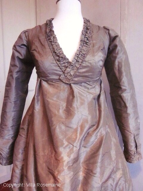
Taffeta dress, ca.1800-1810, Originally found on Villa Rosemaine site, where it does not appear now.
The trouble with making a gown based on an artistic sketch in a book is that you don’t have the most complete sense of what that garment looks like, or how it goes together.
Not to worry, I went ahead anyway, because this is as close to Everest as I will ever get.
But I wanted comparable garments to help guide me. Ages ago I found the gown at left on a French costume site. That’s helpful, in that it explains the trickiness of assembling and wearing this style of garment. Three pieces coming together in the front may be one piece too many.
In making up my pattern, I used the pattern for the Spencer as a starting place because I knew that the set of the sleeves and arm scye were what I wanted. No reason to re-invent that process!
That left me with the luxury of concentrating on the neckline.
That took a few goes with the tracing paper and muslin: I did lose count after a while. There may have been tears, there definitely was swearing. Mr S at one point made jokes about this process appearing on the Discovery Channel’s “How it’s Made” as “the Quaker dress.” He’s really very patient, and I do understand the selective deafness he’s had to develop as a defense against the dark arts of sewing historic clothing.
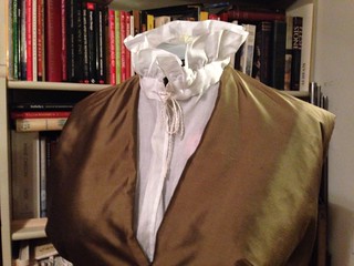
Thank you, Cassidy, for the chemisette!
Eventually, I had a decent lining and even some silk bodice fronts. I fiddled with the fronts, and settled on gathers instead of pleats, but couldn’t quite figure out where the casing went. Some days I can process drawings into objects, some days I can’t. I’d just about reached the point of cutting it all up into the gown I always make when I discovered that the excellent women of the 19th US had patterned the gown from the drawing, too. (If you don’t already use this site, I highly recommend it. Excellent work.) Those pattern pieces look like my pattern pieces, so I decided it was worth carrying on with what I have.
Robe à la Polonaise ca. 1775 British silk Length at CB: 56 in. (142.2 cm) Purchase, Judith and Gerson Leiber Fund, 1981 MMA 1981.314.1
Scrolling through Pinterest lately, I was struck by how different two presentations can make one gown look.
Above, a lovely Ikat-type silk gown with en fourreau back and trim, center front closing and probably a little closer to 1778 or 1780 than 1775.
It’s presented on a mannequin that supports the gown for photography and allows us to see it clearly, from the trim at the neck to the pleats down the back and the pleasant fullness of the skirt.
The gown is shown, we get the details.
And then, in another image, another view.
Robe à la Polonaise ca. 1775 British silk Length at CB: 56 in. Purchase, Judith and Gerson Leiber Fund, 1981 MMA 1981.314.1
In this image, the gown (and its companion) have been styled and accessorized, fichus, hats, ribbons, sashes. The skirt is more fully and completely supported, showing off the silk to even better effect. We lose the trim and pleating details, but the gown is much more attractive in this view.
This is not meant to criticize the images or the handling of the costumes, but to point out that you have to look past the plain record shots in museum databases, and see the gown as it would have been worn. Working with database images, and re-creating garments from those images, requires a leap of imagination.
The more you look (at database photos, exhibition photos, extant garments, fashion plates, other re-creations) the better you will be able to imagine the garment as it might have been, and to make it yourself.
To be fair, original garments cannot always be mounted in stylish and appropriate fashion, but they can still tell us something. The more you look, the more you’ll see.
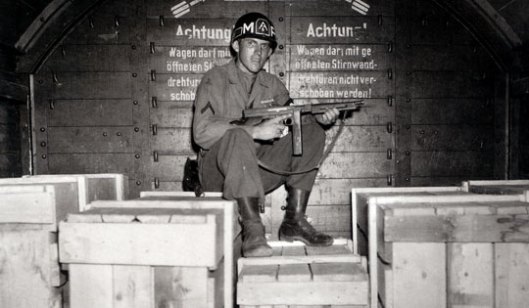
Mr S and I went to the movies on Saturday afternoon to see the long-awaited Monuments Men movie. It had been the hotly anticipated film in my set– guns, art, George Clooney: what’s not to like? We knew the history would be bad, we expected inaccurate museum practices, but still. The ingredients were sound, how bad could it be?
Well…not so bad that I’m sorry I went to see it, but sadly lacking in oomph. When a movie has a website that includes lesson plans, maybe you should not be surprised by its leaden, film-strip qualities.
I’d read the Times review, I knew what I was getting into when we bought our tickets, and we bough them anyway. Art, guns, Clooney, remember?
Here’s what I thought, in somewhat random order:
That movie’s not done. The soundtrack is horrible and needs to go. Also, the voice-over. George Clooney can read me the dictionary at bedtime any time, but the kill the heroics. Please.
But that’s just a symptom of the film and director’s insecurity. This movie isn’t brave enough to be convinced of its own mission, not unlike museums today. It keeps trying so hard to sell me on the idea that art is humanity, our collective soul, that must be saved and is, in fact, worth a life. Dude, I bought that program before I was 12. To toss a cliche back, Just believe. Everything else will follow. If the film, the director, and the star keep trying to sell me on the principle idea, there’s something wrong.
A Rembrandt self-portrait recovered at a German salt mine that had been used as a storehouse, with Harry L. Ettlinger, right. Monuments Men Foundation
There’s no clear enemy, and that leads to the film’s core flabbiness: no tension. Clooney looks slender as I expect my 1940s-era heroes, but the center doesn’t hold. Narrative, dramatic films need tension. (You know, plot.) “Get the art before something bad happens” doesn’t quite do it. Before Hitler burns it? Before the Soviets scoop it up and haul it back to the USSR? Ultimately, Clooney doesn’t need Nazis or Soviets as enemies: his real enemy here is time.
Surely Mr. Clooney schooled himself in the one of the loopiest but most entertaining WWII caper films, Kelly’s Heroes. Acting out of pure self-interest, a group of American soldiers on 3 days R&R race 30 miles behind enemy lines to steal $16 million in gold. It’s not great art, but this is a good movie. Anachronistic? You bet. Oddball is an unlikely character, a Joseph Heller minor figure crossed with a healthy dose of filthy hippie. Crapgame’s a stereotype and so is Big Joe. But there’s tension in this movie, helped along by a pleasant lack of music, which allows us to experience the crunches, thrums, clicks and booms of war. A few scenes in The Monuments Men refer to Kelly’s Heroes (Goodman and Dujardin’s scene on a road is reminiscent of a road ambush in the Eastwood film), but the places where you might expect to find parallels, I found the Eastwood film better. (Yes, we went home and watched it.)
And then there’s Sam Epstein from Newark via Germany. This Monuments Men character left Germany in 1938, with his parents, but his grandfather stayed behind. By 1944/1945, his grandfather had not been heard from in 4 years, but the family knew he’d been sent to Dachau. Though the family lived in a town with a museum with a Rembrandt self-portrait, Sam has never seen it; they weren’t allowed into the museum, because, as the grandfather said, they were ‘too short.’ Why can’t the film confront the confiscation of Jewish property more directly? Why can’t it do a better job with the Holocaust than Clooney’s scene with the German officer? There’s brief scene with a barrel of gold that is absolutely chilling: and I think the film would have been better served with more upfront recognition of that barrel’s contents, what ‘too short’ really means, and the pervasive anti-Semitism of most of the world in the 1940s. (Gentleman’s Agreement, anyone?)
I don’t know enough about the actual history to quarrel over that, and while I will hunt up the books and read them, I was more taken with what seemed like obvious cinematic, movie-making failings– the “I’m heroic!” soundtrack, the lack of central tension, and the curious blindness to, or oddly tangential portrayal of Nazi racial hatred that fueled confiscation programs.
(For another movie about French resistance to Nazi art theft, there is always The Train: Burt Lancaster, art, and guns.)
I wish Clooney had been more willing to frighten us, to make a Saving Private Ryan about saving (or failing to save all of) the art. Feeling the losses and the failures more might have let us see the greatness, the monumentality, if you will, of what the team did accomplish.
Pluses: Good costuming with uniforms that age over time. Plenty of hardware.
Minuses: Soundtrack, unconvincing replicas of masterpieces. Also, nobody had 2014 Hollywood teeth in the 1940s.
Damn terrifying: The vision of Clooney to come in the final scene.
Detail, Picturesque studies and scenes of everyday life. Handcolored etching by Thomas Rowlandson, 1790. Royal Collection Trust. RCIN 810396
Hat tip to Jane Austen’s World for the image at left, which helped me start visualizing another program I’m involved with, this time ‘at home’ in Providence.
When we started reinterpreting the house museum, we began going back through primary sources to figure out how rooms might have been used, and furniture arranged (we don’t have inventories, so we read the house and diaries and letters– but that’s for another post).
Detail, The Tea Party. Oil on canvas by Henry Sargent, 1824. MFA Boston, 19.12
One of the things I remember most vividly was the description of the uncomfortable tea parties Providence women gave, where the guests sat in chairs against the walls of the rooms, balancing a tea cup in one hand and plate in another. Several hard drives later, I’m not sure where that primary source is (the hunt begins tomorrow) but it conjured images of every hostess in Providence a Hyacinth Bucket, and every guest a quivering Elizabeth Next Door.
Detail, The Tea Party. Oil on Canvas by Henry Sargent, 1824. MFA Boston, 19.12
Surely that couldn’t be true? I thought I must be making it up, but then the Rowlandson turns up on the interwebs and there they are, in a row. More famously and closer to home, Henry Sargent’s painting of a Boston tea party in 1824. (The catalog description is rather nice.)
Here’s an 1824 tea party in Boston. While this is later than the tea party we’ve planned at work, it is still full of useful hints about how early, formal tea parties were conducted. We think– or I do, anyway– of ladies in frilly hats seated a tables with cakes heaped on stands and floral tea pots. I hear “tea party” and I think “doilies,” but this is not your grandmother’s tea party. It’s a different kind of social occasion, both more formal and more relaxed.
Detail, The Tea Party, oil on canvas by Henry Sargent, 1824. MFA Boston, 19.12
There’s not a central table to sit around, but instead chairs lined up against the wall, groups of guests, chatting. Others guests stand close to the fireplace, and a pair of ladies have taken a settee and a stool for their close conversation. We can just make out the tiny tea cup in the lady’s gloved hand.
In many ways, this depiction reminds me more of contemporary cocktail parties or open houses with the guests in small, changing groups, and no place to put your cup. Of course, most of us don’t have waiters (that’s who you see in the detail above with his back to us) or fabulous houses on the Tontine Crescent in Boston.
In so many ways, the social customs, habits and mores of the past are lost to us, and as we try to recreate them, the we excavate them from a combination of unlikely sources. Accounts, paintings, diaries, and etiquette manuals serve as sources, but it’s easier to recreate the economics of tea than the structure of a tea party. And once we do have an approximation, will it be a party anyone wants to go to?


You must be logged in to post a comment.