I don’t know about you, but the end of winter often seems harder than the beginning: will this ever end? The snow begins to melt, the dirt turns to mud and you’re walking on ice suspended in pudding. It’s claustrophobic.
George Caleb Bingham (American, 1811–1879). Boatmen on the Missouri, 1846. Oil on canvas. Gift of Mr. and Mrs. John D. Rockefeller 3rd. Fine Arts Museums of San Francisco, 1979.7.15
The weather turns here and the lid finally comes off the sky and reveals that blue above and I think of the vistas of the west, the fields that open up along the rivers of the center of this continent, the fields rough with corn stubble punctuated by trees that pass your car window like drum beats in a song, so regular.
I wonder about the people in the past, wonder what they thought and knew about. Of course it was different for the uneducated and the poor then as now, but if you were wealthy, oh, the places you could go.
Karl Bodmer (Swiss, 1809-1893), White Castles on the Missouri , 1833 watercolor on paper, 9 x 16 3/8 in.; 22.86 x 41.59 cm gift of Enron Art Foundation, Joslyn Art Museum, 1986.49.176
Art history classes will teach you to recognize painters and images, styles and eras, but they won’t teach you the kind of seeing you can only get by being in the same place at the same time in the same light.
Fur Traders Descending the Missouri. Oil on canvas, George Caleb Bingham, 1845. Metropolitan Museum of Art, 33.61
Far from the wide Missouri, I have to be content with images in books and the internet, but I can tell you from looking: Bingham got it right. The sky really does look like that above those rivers and plains; the light is rosy and grey at once, the river swift and glassy. I don’t know how it works, I only know how happy it makes me.
Come, spring: bring us the river and the light.
*Yes, and we had the printers run separations and then FedExed them to other museums for approval. Can you imagine!
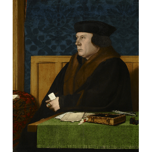
Thomas Cromwell, Hans Holbein the Younger. The Frick Collection,1915.1.76
My personal interwebs have been hating on Sons of Liberty, but I’ve left it alone, largely because I haven’t found the forty-syllable German word for “enjoying watching someone else enjoy hating something.” My FB feed exploded with meta-schadenfreude, but really: hating on that show is so easy it’s cruel.
Except I think the author destroys the accuracy bit. First there’s this:
Peter Ackroyd audaciously asks us to imagine pre-Reformation London as the street markets of Marrakesh. Cheapside would have been a bustling surge of traders and customers, alive with noise and smells, packed with barrels and panniers of fish, fruit and spices, more like a bazaar than the modern city. Equally, to imagine the interiors of English churches in the 1520s, think Andalusian gaudy rather than Hawksmoor’s classicist austerity, the walls covered in brightly painted scenes, the chapels filled with statuary and icons.
Early Tudor London was a bright, brash and bustling place, unlike its whitewashed Protestant successor, and its inhabitants behaved in similarly extravagant fashion. Foreign ambassadors were surprised by Englishmen’s capacity to weep openly and publicly at the slightest provocation. Satirists condemned the aristocracy and burghers for wearing too much bling: flaunting their status in chains of gold so heavy you were amazed they could walk at all.
Then this:
the costumes, beautifully designed and no doubt scrupulously researched, make Tudor society less, rather than more, intelligible. Only Cardinal Wolsey (a melancholic Jonathan Pryce) and Henry VIII (Damian Lewis on imperious form) are allowed bright colours. Everyone else, aristocrat and commoner alike, wear gowns in muted blacks, browns and greens, and so all look much the same – especially as so many scenes take place in near-darkness.
The past sure was a drab place, at least as seen on TV. That’s how you know it’s history! And if the show was so well-researched, why are the costumes so wrong? Because they’re costumes.
Cassidy has gone into good detail about how costume design for a movie or TV programs isn’t about accuracy: it’s about interpretation. And that’s where Sons of Liberty, Wolf Hall, Pride and (or &) Prejudice or Your Favorite Hobby Horse diverge wildly from interpretation in living history. We’re interpreting the past, they’re interpreting a script. (Yes, a script: Sons of Liberty is no way a documentary.)
So I’d save your ire for historic sites and museums and documentaries: what you see on TV is all drama, and just drama. The costuming (and, often, material culture) will in no way be accurate, because it is always designed to further the dramatic goals, and not the accurate depiction of an moment in time.
And that’s why Wolf Hall can be accurate and dull, correct and incorrect. Costume and production designers and directors want us to get the point of the story, so they’ll create dullness where there should be color to make sure we can “read” an otherwise unreadable scene. Now, between you and me, I think good writing can explicate all those class and origin relationships, and that actions large and subtle will show me the emotional relationships, but that’s asking a lot of people who wrecked Mantel’s amazing writing.
In the novel, Mantel has master and servant embrace each other in fleeting triumph. When the dukes go, Wolsey turns and hugs him, his face gleeful. Though it is the last of their victories and they know it, it is important to show ingenuity; 24 hours is worth buying when the king is so changeable. Besides, they enjoyed it. “Master of the Rolls”, Wolsey says, “did you know that, or did you make it up?”
In the adaptation, on the other hand, Wolsey stays seated and Cromwell stands, invisible behind him.
– Did you know that, or did you make it up?
– They’ll be back in a day.
– Well, these days 24 hours feels like a victory.
In the end, I may skip the BBC’s Wolf Hall and re-read the novels. It’s a lot less shouty.
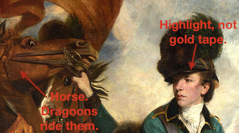
Portrait of Sir Banastre Tarleton (1754-1833) by Joshua Reynolds, 1782. National Gallery (UK) See update below!
By 9:00 on Sunday, I was asleep and missed “Turn,” which Mr S wasn’t even watching because, as he declared, “It’s just a bad show.” On Monday evening, I made it through the opening of the show and gave up for good. But those minutes made me think of the Banastre Tarleton portrait by Sir Joshua Reynolds, and the suggestion on Twitter that “Turn” had no historical consultant.
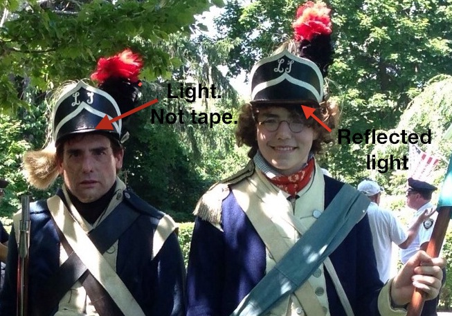
It occurred to me, as I stared at the rather curious headgear worn by Captain Tallmadge (I think it’s stretch lycra over a “Roman” gladiator costume helmet glued to a baseball cap visor and edge-taped with gold foil) that perhaps the people doing the costumes simply lacked visual literacy. This could explain the refugees from Fort Lee who looked like they stepped out of an Emma Lazarus poem, and it could explain the very unfortunate helmet.
Let us look at Banastre Tarleton, hunky bad boy of the British dragoons: he came to mind on Monday night, and what visual relief he is.
Note the light edge of the visor: this is a highlight. The leading edge of a polished surface will shine, and helmets, even of leather, will be reflective. Over time, the edges will polished by wear if not on purpose. I cannot speak to the helmet habits of the horse-mounted, but I know from paintings, and that edge is a highlight.
The Boys last July. Look, shiny, not-taped visor edges.
Reynolds painted what he saw, and just as the Young Mr’s cheekbones are reflecting light off the underside of his visor and Mr S’s helmet edge is shining in the direct light, so too is Colonel Tarleton’s helmet edge shining.
(Yes, there are both mounted and unmounted dragoons within a unit; but I just can’t help feeling that an officer would be mounted more often than he has appeared to be thus far.)
ETA: Heather has graciously pointed out a very nice blog on Turn, which is doing a far more even-handed and informed job of watching and commenting on the show. Thank you, Heather!
Robe à la Polonaise ca. 1775 British silk Length at CB: 56 in. (142.2 cm) Purchase, Judith and Gerson Leiber Fund, 1981 MMA 1981.314.1
Scrolling through Pinterest lately, I was struck by how different two presentations can make one gown look.
Above, a lovely Ikat-type silk gown with en fourreau back and trim, center front closing and probably a little closer to 1778 or 1780 than 1775.
It’s presented on a mannequin that supports the gown for photography and allows us to see it clearly, from the trim at the neck to the pleats down the back and the pleasant fullness of the skirt.
The gown is shown, we get the details.
And then, in another image, another view.
Robe à la Polonaise ca. 1775 British silk Length at CB: 56 in. Purchase, Judith and Gerson Leiber Fund, 1981 MMA 1981.314.1
In this image, the gown (and its companion) have been styled and accessorized, fichus, hats, ribbons, sashes. The skirt is more fully and completely supported, showing off the silk to even better effect. We lose the trim and pleating details, but the gown is much more attractive in this view.
This is not meant to criticize the images or the handling of the costumes, but to point out that you have to look past the plain record shots in museum databases, and see the gown as it would have been worn. Working with database images, and re-creating garments from those images, requires a leap of imagination.
The more you look (at database photos, exhibition photos, extant garments, fashion plates, other re-creations) the better you will be able to imagine the garment as it might have been, and to make it yourself.
To be fair, original garments cannot always be mounted in stylish and appropriate fashion, but they can still tell us something. The more you look, the more you’ll see.


You must be logged in to post a comment.